The colors you choose for your home can significantly influence mood, behavior, and overall ambiance. Color psychology plays a crucial role in interior design, helping to create spaces that feel calm, energetic, cozy, or even luxurious. Understanding the emotional and psychological impact of different colors can guide you in selecting the perfect palette for every room in your home.
The Basics of Color Psychology
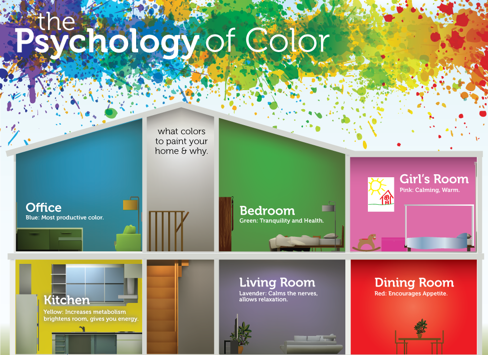
Colors are broadly categorized as warm, cool, and neutral tones, each evoking unique emotional responses. Warm colors like red, orange, and yellow tend to energize and stimulate, while cool colors like blue, green, and purple are calming and soothing. Neutral tones like white, beige, and gray provide balance and flexibility, making them a popular choice for base palettes.
Red: Bold and Energizing
Red is a powerful color associated with passion, energy, and excitement. It’s ideal for spaces where you want to inspire activity and interaction, such as dining rooms or living areas. However, too much red can feel overwhelming, so it’s best used as an accent color or in combination with softer tones.
Blue: Calm and Relaxing
Blue is known for its tranquil and serene qualities, making it a popular choice for bedrooms, bathrooms, and offices. It promotes relaxation and focus, helping to create a peaceful environment. Lighter shades of blue can make a room feel airy and open, while darker blues add depth and sophistication.
Yellow: Cheerful and Inviting
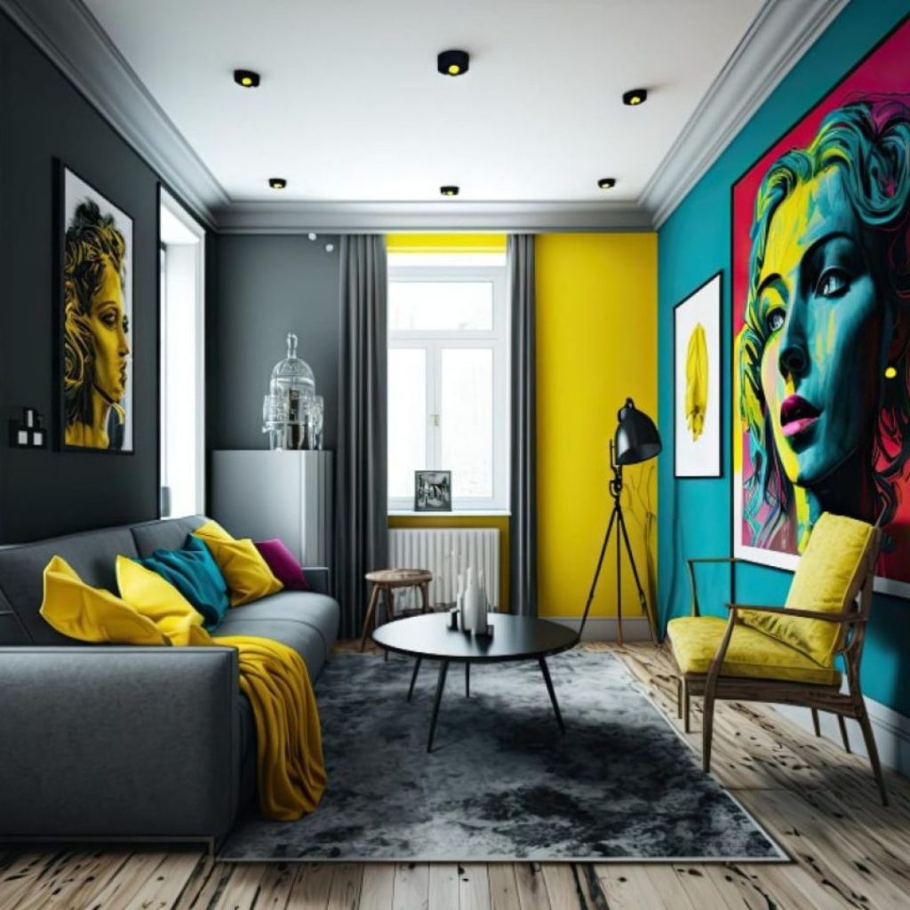
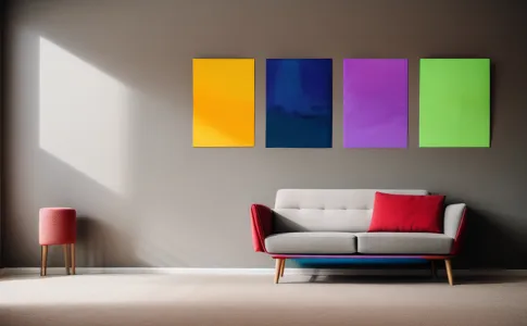
Yellow brings warmth, happiness, and optimism to a space. It’s a great choice for kitchens, dining rooms, or entryways where you want to create an uplifting atmosphere. To avoid overstimulation, use softer shades of yellow or balance it with neutral tones.
Green: Refreshing and Harmonious
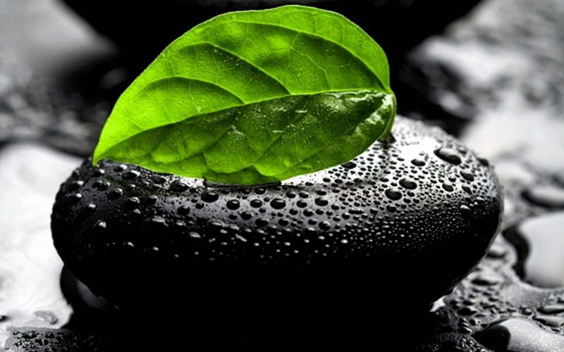
Green symbolizes nature and balance, offering a refreshing and calming effect. It works well in living rooms, bedrooms, and home offices, bringing a sense of vitality and connection to the outdoors. Shades of green can range from muted sage for a soft look to vibrant emerald for a bold statement.
Purple: Luxurious and Creative
Purple is often associated with royalty, luxury, and creativity. Lighter shades like lavender can evoke a soothing, romantic feel, while darker hues like plum add drama and sophistication. Purple is a versatile choice for bedrooms, lounges, or creative spaces.
White: Clean and Minimalist
White is the ultimate neutral, symbolizing cleanliness and simplicity. It creates a blank canvas that allows other elements, such as furniture or artwork, to shine. White walls are perfect for achieving a minimalist aesthetic or making smaller spaces appear larger and brighter.
Gray: Sophisticated and Balanced
Gray is a versatile neutral that pairs well with almost any color. It adds a sense of modernity and sophistication to spaces. Light gray works well in living rooms or kitchens for a fresh look, while darker shades can add depth to bedrooms or home offices.
Black: Bold and Elegant
Black conveys elegance, power, and drama. It’s best used sparingly to create contrast or highlight architectural features. Black accents, such as furniture or trim, can add sophistication without overwhelming a space.
How to Choose the Right Palette for Your Home
When selecting a color palette, consider the following:
- Function of the Room: Determine how you want the space to feel and function. For example, calming colors like blue and green are great for bedrooms, while energizing tones like yellow or red work well in kitchens and dining rooms.
- Natural Light: The amount of natural light a room receives affects how colors appear. Bright spaces can handle darker or bolder colors, while dimly lit rooms benefit from lighter shades.
- Complementary Colors: Use a color wheel to find complementary colors that work well together. This ensures a cohesive and visually appealing look.
- Personal Preference: Ultimately, your home should reflect your personality and taste. Choose colors that resonate with you and make you feel comfortable.
Using Accent Colors and Accessories
If you’re hesitant to commit to bold wall colors, incorporate accent colors through furniture, artwork, rugs, and cushions. This allows you to experiment with color without making permanent changes.
Final Thoughts
Color psychology is a powerful tool in interior design, helping you create spaces that not only look beautiful but also enhance your mood and well-being. By understanding the emotional impact of different colors and considering your personal preferences, you can design a home that feels harmonious and inviting. Whether you prefer calming blues, energizing reds, or sophisticated neutrals, the right palette can transform your living space into a true reflection of your style and needs.